Risk analysis run on the holdings you own, position by position
Sharpe, beta and volatility sit beside value at risk, the deepest fall your allocation has lived through, and four real crashes replayed one position at a time.
 AllInvestView
The numbers most people mean by portfolio risk
Risk-adjusted return, market sensitivity, how wide the swings are, and how far down it has already gone. Every one of them is calculated for the whole portfolio and again for each holding, so a single position cannot hide inside an average.
Sharpe ratio
Return per unit of risk, annualised from your daily returns. The risk-free rate is a field you set rather than a constant we picked, and the page states the rate it used next to the figure. What the Sharpe ratio means.
Beta
How hard your portfolio moves when its benchmark moves. Pick the benchmark you actually measure yourself against. This is also the beta the stress tests fall back on when an event predates your holdings. What beta means.
Volatility
Annualised standard deviation of returns, for the portfolio and for each holding beside its mean return. Two positions with the same gain rarely got there through the same ride. What standard deviation means.
Maximum drawdown
The deepest peak to trough fall in the backtest of the allocation you hold now, with the date it topped out and the date it bottomed. What maximum drawdown means.
These four come from the daily return window your holdings share, and the page prints the start date of that window above them.
The part most trackers stop before
A ratio tells you the size of the risk. It does not tell you where the risk lives, what a bad year looks like, or what a different mix of the same holdings would have done.
A thousand versions of your portfolio, not one line
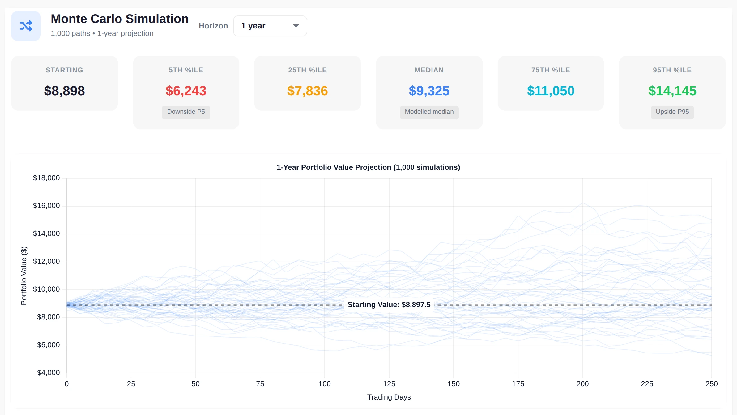
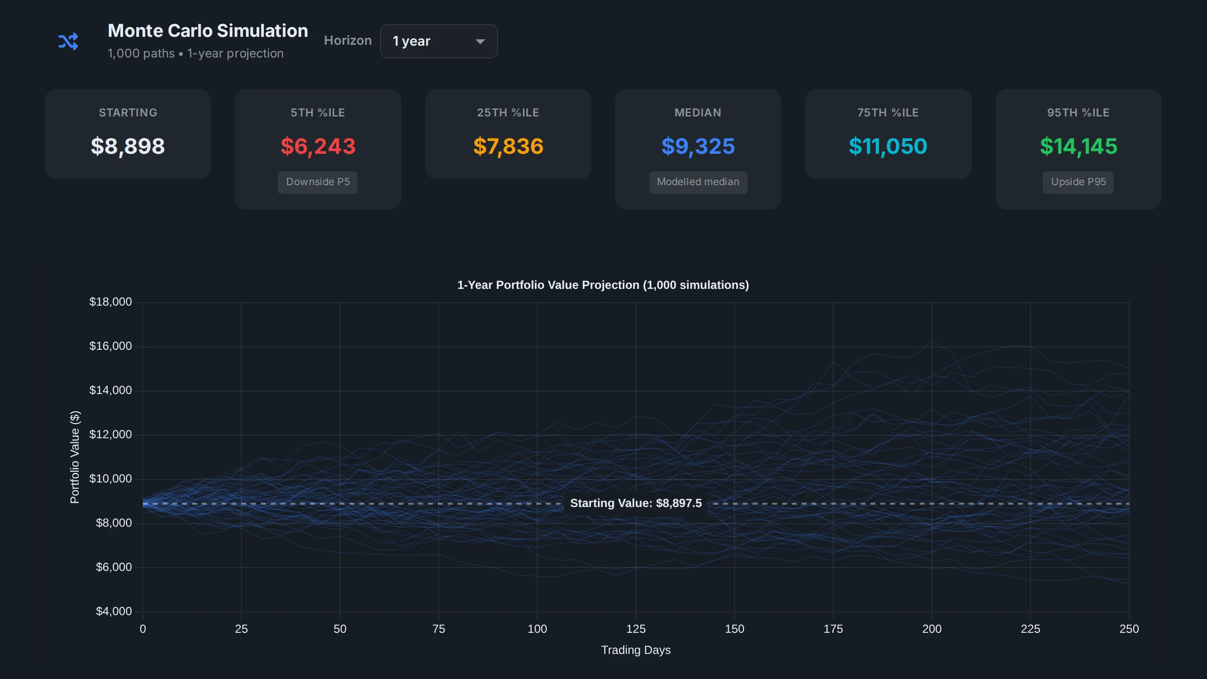
A thousand paths are drawn from the return and covariance of your own holdings, and the chart keeps the spread instead of averaging it away. Above the chart sit the fifth, twenty-fifth, median, seventy-fifth and ninety-fifth percentile outcomes in your own currency, so the bad version of the same portfolio is on screen next to the good one.
Set the horizon anywhere from one to ten years and the projection is rebuilt around it. How a Monte Carlo simulation works.
 AllInvestView
Efficient frontier
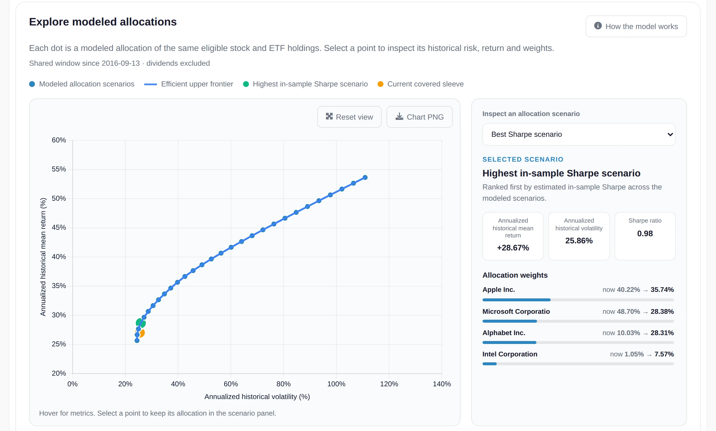
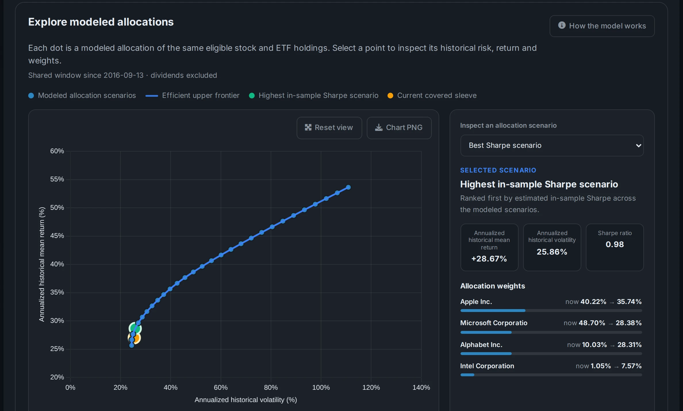
Markowitz mean variance optimisation across your holdings. The highest Sharpe mix is laid over your current weights, holding by holding, and you can cap how much any one position is allowed to take before the optimiser runs, which keeps the answer something you would actually trade.
Value at risk
The fifth and first percentile days of your own return history, at 95% and 99%. It is read off the returns your allocation produced, not fitted to a bell curve, and the page says plainly that it is a threshold rather than a worst case.
Correlation matrix
A colour graded grid of how your holdings move against each other. Twelve tickers that all rise and fall together is one bet wearing twelve names, and the grid is where that shows up. What correlation means.
Risk contribution
Each holding's share of total portfolio variance, next to its share of your money. A position worth four percent of the portfolio can be responsible for far more than four percent of the movement, and that gap is the useful number.
Where each position is standing right now
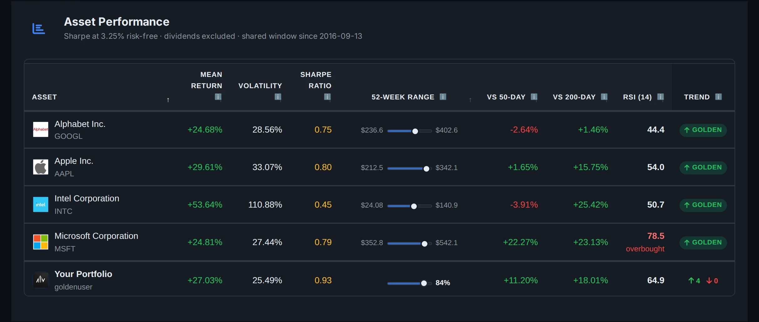
The 52 week range, the two moving averages and RSI, per holding
Every holding shows its 52 week high and low with the last close marked between them, so you can see at a glance whether a position is sitting near the top of its year or near the bottom.
Beside it: distance from the 50 day and 200 day moving averages, and which side of the other each average is on, which is the golden cross or death cross state. Then a 14 day Wilder RSI, flagged once it passes 70 or drops under 30.
The table closes with a value-weighted row, so the portfolio gets the same reading as its parts rather than an unweighted average of tickers.
See it in the full feature list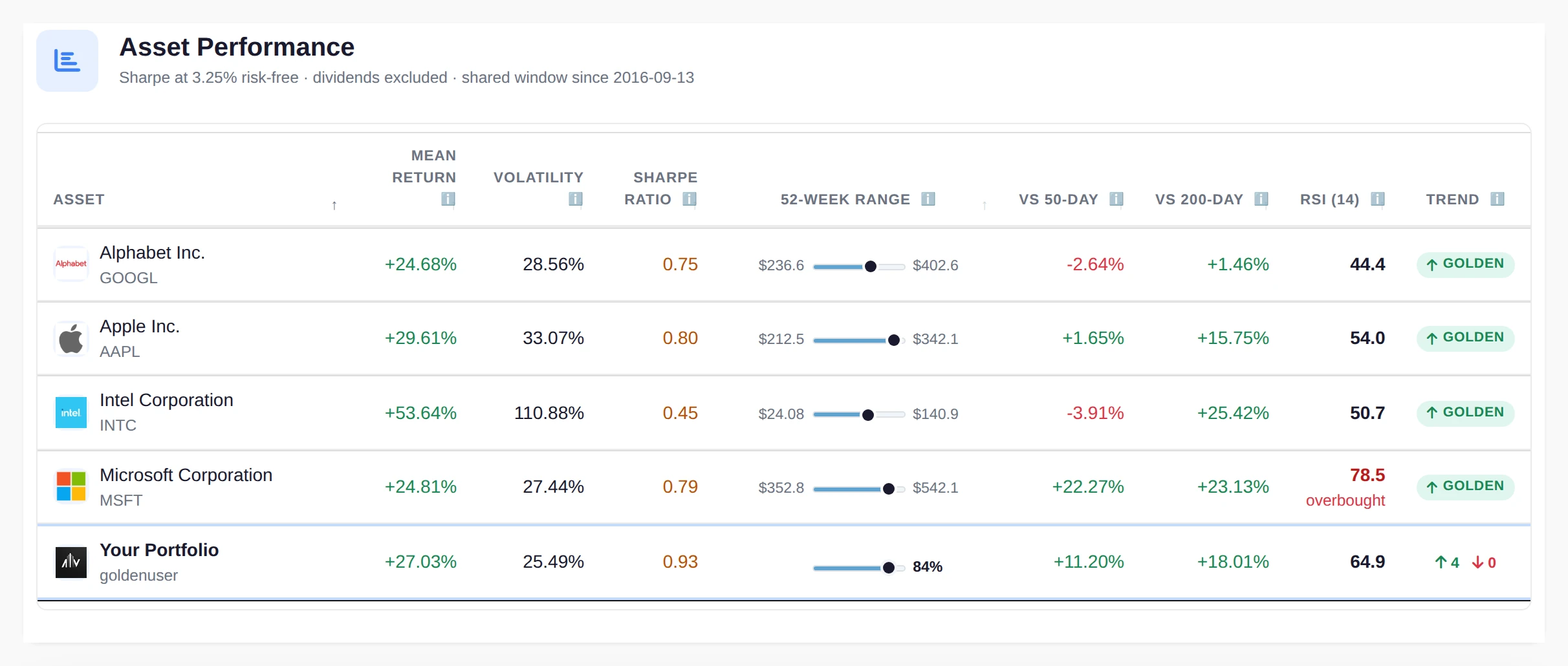
 AllInvestView
The moving averages and the mean need 200 trading days of closes behind a holding before they appear, and the table says how many of yours cleared that.
What if every holding reverted to its average price
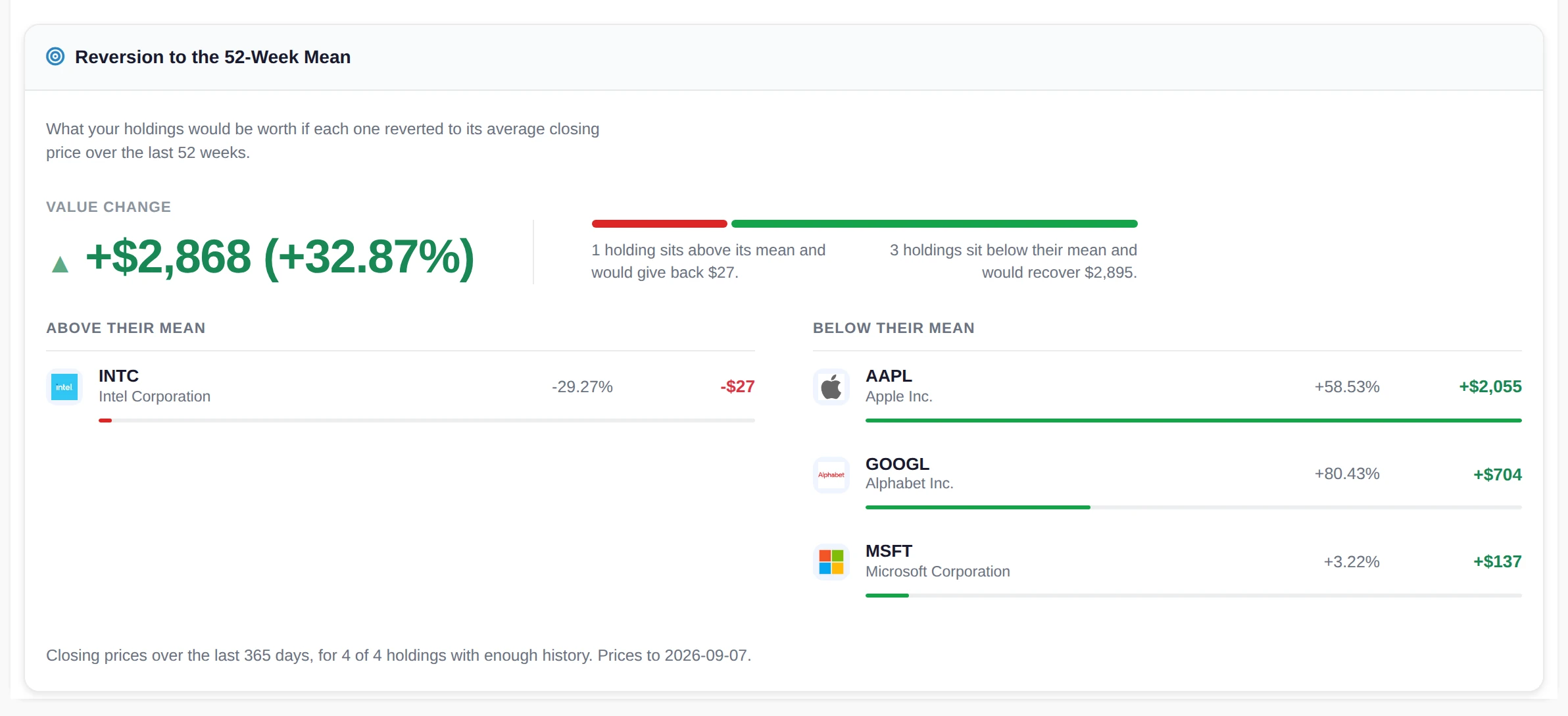
Reversion to the 52 week mean
Take each holding's average closing price over the last year and price your portfolio as if every position reverted to it. The result is one figure with the positions split into the ones trading above their mean and the ones trading below.
It is not a forecast and it is not pretending to be one. It answers a question that sits underneath a lot of nervousness about a portfolio: how much of what you are looking at is the year, and how much is the last few weeks.
 AllInvestView
Four crashes, run against what you hold today
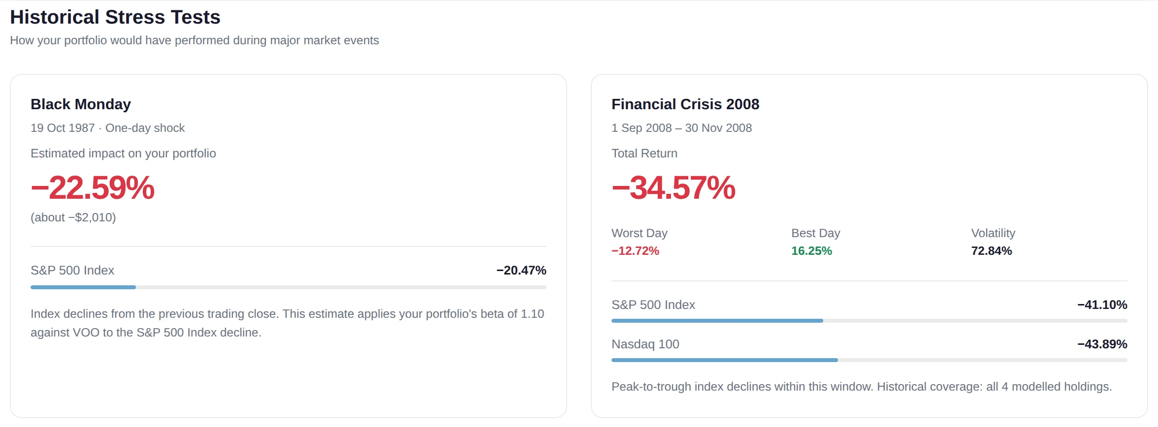
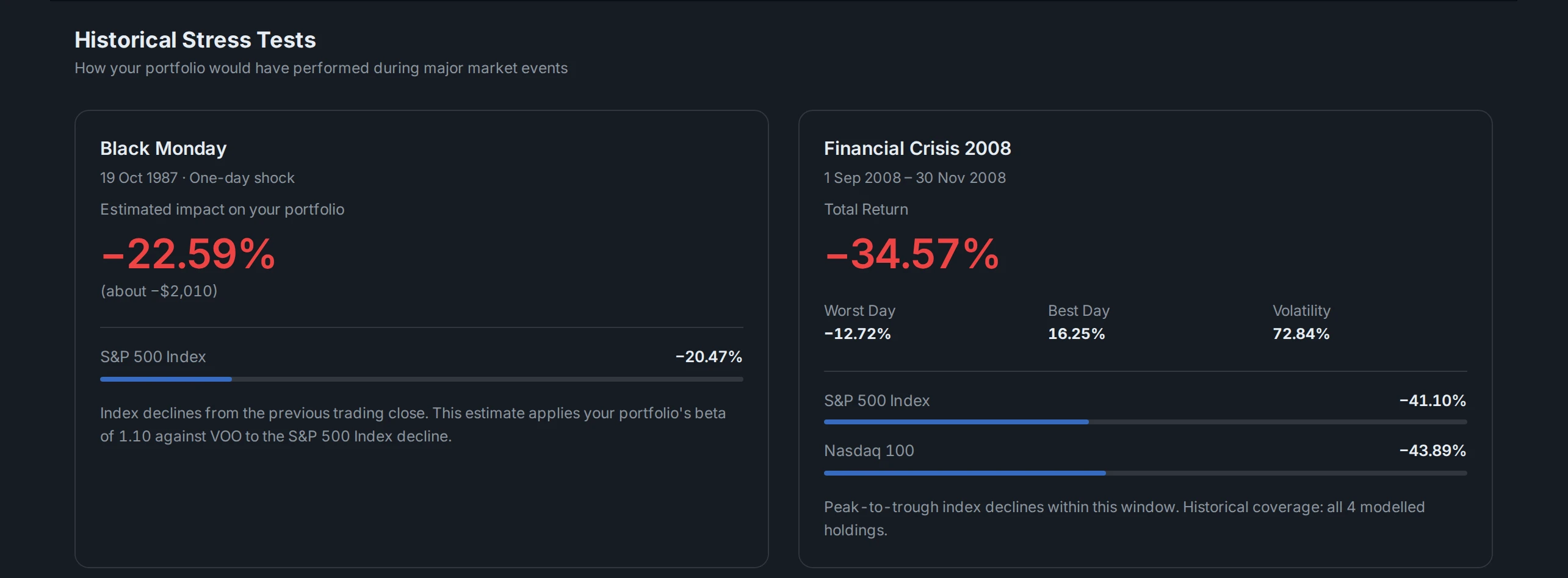
Black Monday in October 1987, the 2008 financial crisis, the COVID-19 crash and the 2022 rate hike cycle. Each card carries what the S&P 500 did over that window, and the Nasdaq 100 alongside it from 2008 onwards, so your result has something to sit against.
An answer even when you have no history that far back
Where your holdings can be priced through the event, it is replayed position by position, with the worst day, the best day and how much of your allocation had prices for that period.
Where they cannot, and for most portfolios 1987 is exactly that case, your portfolio beta is applied to the index fall for that window and you get an estimate. The card names the beta it used and the benchmark it came from, so you can weigh the estimate for what it is instead of staring at an empty panel.
 AllInvestView
The whole analysis as a PDF
One document
The risk metrics, the correlation summary and the stress test results come out as a single risk report, laid out to be read rather than dumped from a screen.
Fixed at a date
The figures are frozen at the moment you generate it, which is what makes it worth keeping. Generate one each quarter and you have a record of how the risk profile moved.
Something to hand over
Readable by someone who does not have your login, which covers the adviser conversation, the partner who wants to understand the exposure, and your own file.
If a term here is new
Each of these has its own page with a worked example, rather than a sentence squeezed into a tooltip.
Risk analysis, answered
Point it at your real portfolio
Link a broker or bring a file. The numbers here fill in from the positions you actually hold.
Create a free account